 See the Machine
About the Mark
Every brand mark is somebody's overthought afternoon. Ours took several. Here's what we landed on and why.
The mark is a compass. An outer ring, a fainter inner ring, an 8-point star, and a small orange pin dead in the middle. That's it. No wordmark glued to it, no swooshes, no gradient that tries to look like a sunset. Just a compass.
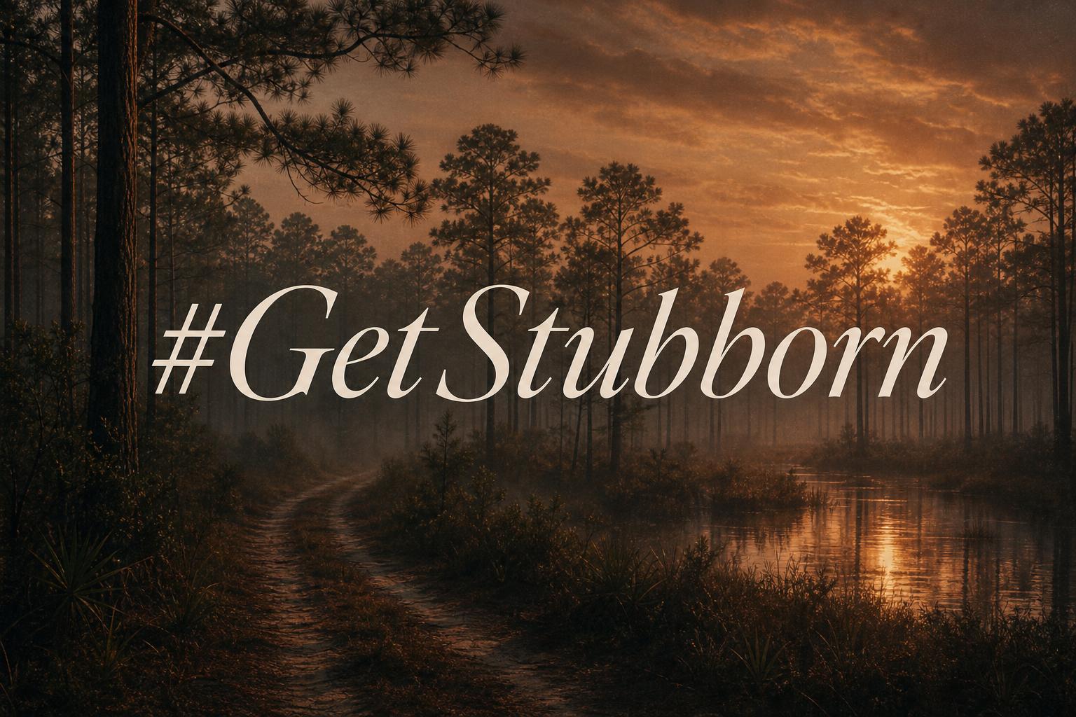
Why a compass. Because the whole point of this company is getting people back out to a place on a map they thought they'd lost. Compass means orientation. Compass means heading somewhere on purpose. Compass also looks right on a tailgate sticker, which mattered more than I'll admit.
The 8 points aren't decorative. The four cardinal points — N, S, E, W — are the big ones, drawn long and clean in a sage-green that we call 'meadow.' That's where you're going. The four diagonals — NE, SE, SW, NW — are shorter, drawn in a muted ink. Those are the in-between routes. The detours. The 'I didn't plan to end up here but I'm glad I did' moments. A good day outside has both.
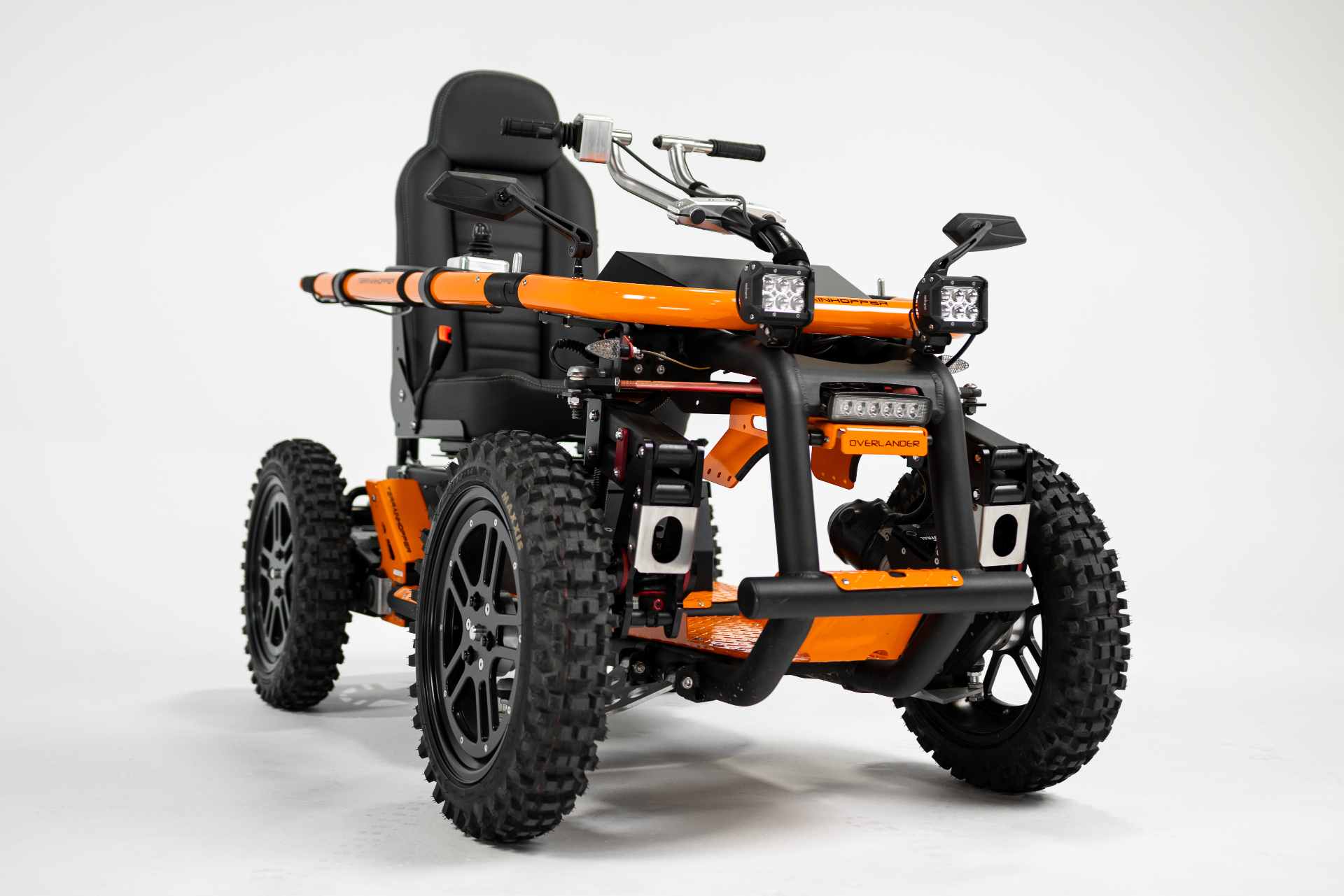
The colors. Meadow green for the cardinals, because the South is green more days of the year than it isn't. Deep ink for the rings and the diagonals, because contrast matters and because a logo has to read at the size of a hat patch. And one small pin of safety orange right in the middle. That orange shows up everywhere on the site, on the brochures, eventually on the machines. It's the pin on the map. It's the hunter-orange vest. It's the 'I'm here, come find me' color. It's the heart of the mark on purpose.
If you ever see the mark and the orange pin's missing, somebody printed it wrong. Tell us. We'll send a fresh sticker.